To name this perfume I began by mind mapping words associated with the audience and the feelings that are sold through the perfume. The name that I have stuck with is Classy Mum.
Reference Ads
To illustrate the point that audience is more important than product in the perfume industry I am going to design 3 packages that wear their intentions on their chest rather than covering it in french words and perceived heritage.
This package is going to be based on higher end perfumes that are generally aimed at older audience with higher income and who are more interested in elegance and class than making a bold statement or promiscuity.
Using the mood boards I put together for each made up perfume I am going to design I began with 'Classy Mum', a perfume that is aimed at females over the age of 40 that have probably got kids/ responsibility and only have the opportunity to go out once in a while so want a scent that is a bit more special than your daily use stuff.
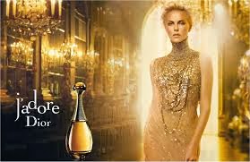
Taking inspiration from Dior and Dolce&Gabanna this packaging is predominantly gold with minimal type/ clutter.
I used Gill Sans to communicate heritage, reliability and trustworthy craftsmanship.
Tweaking the letterforms to make it lock tighter as a logo
I thought using an 'i' instead of 'y' would give it a bit of european class, however I think it confuses the point of the project a bit.
Testing the logotype
By putting the logo on a stock image that is similar to the identity of the perfume I could see if the type suited it.
I added legal info on the back of the pack for authenticity, I also added a small paragraph that summed up the point of the product saying:
'Disclaimer: No added benefits are promised any interpretation of benefits gained from using 'the special occasion' is purely down to consumer assumption. This is just some fragrant chemicals in a fancy box.'
I had some trouble sourcing stock images to use for the adverts as they are quite expensive for large sizes, by scouring the free image sites I have managed to find images that communicate the message that is associated with the product.
Double page Spread

Single page advert
GIFT BAG
BOX NET
PAPER STOCK ELEMENTS
These paper inserts will fit inside the top of the perfume box and the strips are to be used as testers.
These paper inserts will fit inside the top of the perfume box and the strips are to be used as testers.
Summary/ Evaluation
I'm happy with the overall aesthetic of the high end perfume, I think that it typically takes the signifiers that are used by Dolce&Gabanna and Dior to target a more mature audience with higher disposable income.
If I were to extend this project I could look into which celebrities would fit the stereotypical identity of this product. I could also look into point of sale displays and window displays that would appear in stores such as John Lewis and Harvey Nicholls. Pushing the brief even further video promotion could be developed for online campaigns etc.


No comments:
Post a Comment